심화프로젝트 4일차 - 선형회귀 마무리, K-fold, smothe
1. 재현율, 정밀도 점검
각 6개의 결함에 대해 재현율과 정밀도를 점검해본결과
| 결함종류 | Pastry | Z_Scratch | K_Scratch | Stains | Dirtiness | Bumps |
| 정밀도 | 0.6364 | 0.8421 | 0.9342 | 0.8889 | 0 | 0.6000 |
| 재현율 | 0.2414 | 0.7805 | 0.8554 | 0.6154 | 0 | 0.3478 |
| F-1 Score | 0.3500 | 0.8101 | 0.8931 | 0.7273 | 0 | 0.4404 |
그리고 K-fold도 적용해본 결과
--- 5-Fold 교차 검증 결과 (K=5) ---

=======================================================
--- 결함 유형: Pastry ---
K-Fold ROC-AUC Scores (K=5): [0.98323385 0.89396067 0.81969803 0.89925002 0.85687178]
평균 ROC-AUC: 0.8906 (표준편차: 0.0545)
=======================================================

=======================================================
--- 결함 유형: Z_Scratch ---
K-Fold ROC-AUC Scores (K=5): [0.96894737 0.99857143 0.99511278 0.98541353 0.68496241]
평균 ROC-AUC: 0.9266 (표준편차: 0.1213)
=======================================================

=======================================================
--- 결함 유형: K_Scratch ---
K-Fold ROC-AUC Scores (K=5): [0.77047146 0.99950372 0.99483044 0.98734491 0.98097601]
평균 ROC-AUC: 0.9466 (표준편차: 0.0883)
=======================================================

=======================================================
--- 결함 유형: Stains ---
K-Fold ROC-AUC Scores (K=5): [0.9854851  0.99503438 0.99885409 0.9971403  0.99678284]
평균 ROC-AUC: 0.9947 (표준편차: 0.0047)
=======================================================

=======================================================
--- 결함 유형: Dirtiness ---
K-Fold ROC-AUC Scores (K=5): [0.86713287 0.91439595 0.77839402 0.97636846 0.89148782]
평균 ROC-AUC: 0.8856 (표준편차: 0.0647)
=======================================================

=======================================================
--- 결함 유형: Bumps ---
K-Fold ROC-AUC Scores (K=5): [0.71189123 0.89736201 0.86879058 0.60642619 0.6788917 ]
평균 ROC-AUC: 0.7527 (표준편차: 0.1122)
=======================================================

=======================================================
--- 결함 유형: Other_Faults ---
K-Fold ROC-AUC Scores (K=5): [0.61520155 0.71894465 0.35277412 0.49869712 0.57921241]
평균 ROC-AUC: 0.5530 (표준편차: 0.1226)
=======================================================
몇가지 요인에 대해서 ROC-AUC 결과가 차이가 나는 것 을 확인할 수 있었습니다.
튜터님께서 이를 해결하기 위해서 Smothe 와 최적 임계값을 찾아서 모델을 돌려보라고 추천해주셨고 Smothe 를 진행한뒤에 결함당 최적 임계값을 일일이 찾아보았습니다.
2. Smothe 및 최적 임계값 도출
from sklearn.metrics import roc_auc_score, accuracy_score, confusion_matrix, f1_score, recall_score, precision_score
from sklearn.model_selection import train_test_split
from sklearn.preprocessing import MinMaxScaler
from sklearn.linear_model import LogisticRegression

from imblearn.over_sampling import SMOTE

independent_vars = [
    'Luminosity_Index','Orientation_Index','Minimum_of_Luminosity','Edges_Y_Index',
    'Maximum_of_Luminosity','Edges_X_Index','Outside_X_Index','Length_of_Conveyer',
    'SigmoidOfAreas','Empty_Index','Square_Index','Steel_Plate_Thickness','Y_Center','X_Center',
    'LogOfAreas','Pixels_Areas'
]
target_var = 'Pastry'

# 3. 데이터 분리 및 스케일링 (이전 코드와 동일)
X_full = df[independent_vars]
y_full = df[target_var]

# 변수명을 원본 코드와 동일하게 유지
X_train_test, X_test_test, y_train_test, y_test_test = train_test_split(X_full, y_full, test_size=0.2, random_state=42)

scaler = MinMaxScaler()
X_train_test_scaled = scaler.fit_transform(X_train_test)
X_test_test_scaled = scaler.transform(X_test_test)

# ------------------------------------------------------------------
# 4. SMOTE 적용 (훈련 데이터에만 적용)
# ------------------------------------------------------------------
print(f"SMOTE 적용 전 훈련 데이터 'Pastry' 샘플 수: {y_train_test.sum()}")

smote = SMOTE(random_state=42)
# 스케일링된 훈련 데이터에 SMOTE를 적용합니다.
X_train_smote, y_train_smote = smote.fit_resample(X_train_test_scaled, y_train_test)

print(f"SMOTE 적용 후 훈련 데이터 'Pastry' 샘플 수: {y_train_smote.sum()}")
print(f"SMOTE 적용 후 총 훈련 데이터 샘플 수: {len(y_train_smote)}")
# ------------------------------------------------------------------

# 5. 로지스틱 회귀 (SMOTE 적용된 데이터로 학습)
# (변수명을 model_smote로 변경하여 구분)
model_smote = LogisticRegression(random_state=42, solver='liblinear', max_iter=1000)
# SMOTE 처리된 X_train_smote, y_train_smote로 학습
model_smote.fit(X_train_smote, y_train_smote)

# 6. 예측 (SMOTE가 적용되지 않은 X_test_test_scaled 사용)
# SMOTE 모델로 원본 테스트 데이터의 확률 예측
y_pred_proba_smote = model_smote.predict_proba(X_test_test_scaled)[:, 1]

# 7. 임계값 조정 함수 (이전 코드와 동일)
def evaluate_with_threshold(y_true, y_proba, threshold):
    """주어진 임계값으로 예측하고 평가 지표를 계산합니다."""
    y_pred_new = (y_proba >= threshold).astype(int)
    recall_new = recall_score(y_true, y_pred_new, zero_division=0)
    precision_new = precision_score(y_true, y_pred_new, zero_division=0)
    f1_new = f1_score(y_true, y_pred_new, zero_division=0)
    conf_matrix_new = confusion_matrix(y_true, y_pred_new)
    return recall_new, precision_new, f1_new, conf_matrix_new

# 8. 임계값 설정
recall_threshold = 0.781
recall_new, precision_new_for_recall, f1_new_for_recall, conf_matrix_recall = evaluate_with_threshold(
    y_test_test, y_pred_proba_smote, recall_threshold
)

print(f"\n--- 로지스틱 회귀 (SMOTE + 임계값 {recall_threshold}) 결과 ---")
print(f"정확도 (Accuracy): {accuracy_score(y_test_test, (y_pred_proba_smote >= recall_threshold).astype(int)):.4f}")
print(f"ROC-AUC 점수: {roc_auc_score(y_test_test, y_pred_proba_smote):.4f}")
print("혼동 행렬(Confusion Matrix):")
print(conf_matrix_recall)
print(f"재현율 (Recall): {recall_new:.4f}")
print(f"정밀도 (Precision): {precision_new_for_recall:.4f}")
print(f"F1-Score: {f1_new_for_recall:.4f}")

# (회귀계수는 SMOTE로 학습된 모델의 계수를 출력)
coef_df_smote = pd.DataFrame({
    'Variable': X_full.columns,
    'Coefficient': model_smote.coef_[0]
}).sort_values(by='Coefficient', ascending=False)

print('\n회귀계수 (SMOTE 모델):')
print(coef_df_smote)
SMOTE 적용 전 훈련 데이터 'Pastry' 샘플 수: 129
SMOTE 적용 후 훈련 데이터 'Pastry' 샘플 수: 1423
SMOTE 적용 후 총 훈련 데이터 샘플 수: 2846
--- 로지스틱 회귀 (SMOTE + 임계값 0.781) 결과 ---
정확도 (Accuracy): 0.9227
ROC-AUC 점수: 0.9329
혼동 행렬(Confusion Matrix):
[[335 24]
[ 6 23]]
재현율 (Recall): 0.7931
정밀도 (Precision): 0.4894
F1-Score: 0.6053
회귀계수 (SMOTE 모델):
Variable Coefficient
1 Orientation_Index 5.765155
3 Edges_Y_Index 3.597749
4 Maximum_of_Luminosity 2.604717
7 Length_of_Conveyer 1.745349
12 Y_Center 0.984650
5 Edges_X_Index 0.689431
13 X_Center 0.499017
11 Steel_Plate_Thickness -0.000202
0 Luminosity_Index -0.282727
6 Outside_X_Index -0.573524
15 Pixels_Areas -0.715986
8 SigmoidOfAreas -1.140740
14 LogOfAreas -2.369225
10 Square_Index -4.264417
9 Empty_Index -5.294367
2 Minimum_of_Luminosity -5.317620
이렇게 Smothe를 적용하고 임계값을 일일이 수정해서 F1-Score가 높은 최적 임계값을 찾아내었습니다.
그리고 각 요인에 대해서 train 데이터와 test 데이터를 나누어 시각화를 하여 잘 조치되었는지 확인했습니다.
import matplotlib.pyplot as plt
import pandas as pd
import numpy as np
import matplotlib.font_manager as fm

# --- 1. 데이터 정의 ---
data_cv = {
    'Accuracy_mean': [0.9130, 0.9027, 0.9594, 0.9897, 0.9652, 0.7603],
    'ROC-AUC_mean': [0.9265, 0.9273, 0.9877, 0.9962, 0.9427, 0.8057],
    'Recall_mean': [0.6520, 0.6703, 0.8622, 0.8106, 0.6417, 0.6768],
    'Precision_mean': [0.4729, 0.5116, 0.9306, 0.9071, 0.4289, 0.4489],
    'F1-Score_mean': [0.5451, 0.5785, 0.8948, 0.8446, 0.5068, 0.5395]
}
data_test = {
    'Accuracy': [0.8995, 0.8995, 0.9510, 0.9974, 0.9742, 0.7320],
    'ROC-AUC': [0.9066, 0.9362, 0.9912, 0.9883, 0.9438, 0.7682],
    'Recall': [0.5000, 0.7105, 0.7821, 0.9286, 0.4545, 0.6500],
    'Precision': [0.4103, 0.4909, 0.9683, 1.0000, 0.5556, 0.4062],
    'F1-Score': [0.4507, 0.5806, 0.8652, 0.9630, 0.5000, 0.5000]
}

faults = ['Pastry', 'Z_Scratch', 'K_Scratch', 'Stains', 'Dirtiness', 'Bumps']

df_cv = pd.DataFrame(data_cv, index=faults)
df_test = pd.DataFrame(data_test, index=faults)

# --- 2. 폰트 설정 (이전에 발생한 오류 해결) ---
font_name = 'Malgun Gothic' # Windows 사용자용 기본 폰트
# font_name = 'AppleGothic' # macOS 사용자용 폰트
# font_name = 'NanumBarunGothic' # 나눔 폰트가 설치되어 있다면

plt.rcParams['font.family'] = font_name
plt.rcParams['axes.unicode_minus'] = False # 마이너스 기호 깨짐 방지


# --- 3. 그래프 생성 함수 ---
def plot_comparison_bar(metric_name, df_cv, df_test, faults):
    """CV 평균과 테스트 세트 결과를 비교하는 그룹형 막대 그래프를 그립니다."""

    cv_values = df_cv[f'{metric_name}_mean']
    test_values = df_test[metric_name]

    x = np.arange(len(faults))  # 결함 개수
    width = 0.35  # 막대 폭

    fig, ax = plt.subplots(figsize=(12, 6))

    # CV 막대 (왼쪽)
    rects1 = ax.bar(x - width/2, cv_values, width, label='CV 평균', color='skyblue', alpha=0.8)

    # Test 막대 (오른쪽)
    rects2 = ax.bar(x + width/2, test_values, width, label='Test 세트', color='mediumpurple', alpha=0.8)

    # 그래프 제목 및 레이블 설정
    ax.set_title(f'6개 결함에 대한 {metric_name} 비교 (CV vs Test)', fontsize=16, fontweight='bold', y=1.03)
    ax.set_ylabel('점수 (Score)', fontsize=12)
    ax.set_ylim(0.0, 1.05) # Y축 범위 설정
    ax.set_xticks(x)
    ax.set_xticklabels(faults, rotation=0, ha='center', fontsize=10) # X축 레이블
    ax.legend(loc='lower right')
    ax.grid(axis='y', linestyle='--', alpha=0.6)

    # 막대 위에 값 표시
    def autolabel(rects):
        for rect in rects:
            height = rect.get_height()
            ax.annotate(f'{height:.3f}',
                        xy=(rect.get_x() + rect.get_width() / 2, height),
                        xytext=(0, 3),  # 3 points vertical offset
                        textcoords="offset points",
                        ha='center', va='bottom', fontsize=10)

    autolabel(rects1)
    autolabel(rects2)

    plt.tight_layout()
    plt.show()


# --- 4. 시각화 실행 (가장 중요한 ROC-AUC와 F1-Score를 시각화) ---
plot_comparison_bar('ROC-AUC', df_cv, df_test, faults)
plot_comparison_bar('F1-Score', df_cv, df_test, faults)

# 필요하다면 다른 지표도 시각화 가능 (주석 해제 후 사용)
plot_comparison_bar('Accuracy', df_cv, df_test, faults)
plot_comparison_bar('Recall', df_cv, df_test, faults)
plot_comparison_bar('Precision', df_cv, df_test, faults)

이런식으로 5개의 항목 ROC-AUC, 정확도, 정밀도, 재현성, F1-score 별로 시각화를 하였습니다.
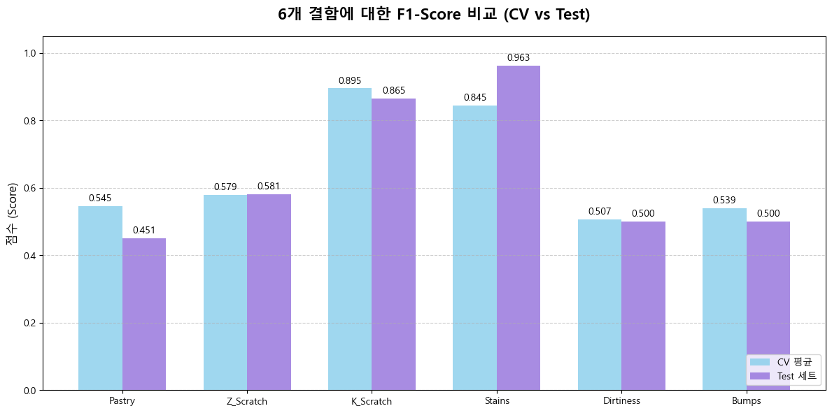
확실하게 F1 - score가 개선된것을 볼 수 있습니다.
다만 F1 - score 는 0.8이상은 되어야지 모델링이 잘되었다고 볼 수 있는데 아마 데이터 쪽에 문제가 있던것 같습니다.
아마 이 문제에 대해서 왜 이런식으로 데이터가 나왔는지 내일 팀원들과 의논해볼 것 같습니다.
3. 각 결함에 미치는 요인 분석(feature importance)
import matplotlib.pyplot as plt
import pandas as pd
import numpy as np
import matplotlib.font_manager as fm

# --- 1. 데이터 정의 (Pastry 회귀 계수 전체) ---
data = {
    'Variable': [
        'Empty_Index', 'Minimum_of_Luminosity', 'Edges_Y_Index', 'Square_Index', 'LogOfAreas',
        'Steel_Plate_Thickness', 'Orientation_Index', 'Y_Center', 'SigmoidOfAreas',
        'Outside_X_Index', 'Luminosity_Index', 'Pixels_Areas', 'Edges_X_Index',
        'X_Center', 'Maximum_of_Luminosity', 'Length_of_Conveyer'
    ],
    'Coefficient': [
        5.104682, 2.600773, 2.587082, 0.725582, 0.537049,
        -0.240242, -0.575242, -1.652813, -1.831749,
        -2.231577, -3.415583, -3.733461, -3.979259,
        -4.124508, -5.088935, -6.508258
    ]
}
df_coef = pd.DataFrame(data)

# 계수 값의 부호에 따라 색상 지정
colors = ['red' if c > 0 else 'blue' for c in df_coef['Coefficient']]

# 영향력을 명확히 보기 위해 계수 값 크기(절댓값) 순으로 정렬
df_coef_sorted = df_coef.iloc[df_coef['Coefficient'].abs().argsort()[::-1]]
colors_sorted = ['red' if c > 0 else 'blue' for c in df_coef_sorted['Coefficient']]


# --- 2. 폰트 설정 ---
font_name = 'Malgun Gothic'
# font_name = 'AppleGothic'
try:
    plt.rcParams['font.family'] = font_name
    plt.rcParams['axes.unicode_minus'] = False
except Exception:
    print(f"경고: 폰트 '{font_name}'를 찾을 수 없습니다. 기본 폰트로 출력됩니다.")


# --- 3. 시각화 ---
plt.figure(figsize=(12, 7))

# 막대 그래프 생성 (절댓값 순으로 정렬된 데이터 사용)
bars = plt.bar(df_coef_sorted['Variable'], df_coef_sorted['Coefficient'], color=colors_sorted, alpha=0.8)

# 그래프 제목 및 레이블 설정
plt.title('Pastry 결함 모델의 모든 변수별 회귀 계수 (영향력 순)', fontsize=16, fontweight='bold', y=1.03)
plt.ylabel('회귀 계수 값 (영향력)', fontsize=12)
plt.xlabel('독립 변수', fontsize=12)

# X축 레이블 회전
plt.xticks(rotation=45, ha='right', fontsize=10)

# 범례 추가 (색상 의미 설명)
plt.legend(handles=[
    plt.Rectangle((0, 0), 1, 1, fc='red'),
    plt.Rectangle((0, 0), 1, 1, fc='blue')],
    labels=['양의 영향 (증가)', '음의 영향 (감소)'],
    loc='upper right')

# 막대 위에 계수 값 표시
for bar in bars:
    yval = bar.get_height()
    plt.text(bar.get_x() + bar.get_width()/2.0,
             yval + (0.3 * np.sign(yval) if np.abs(yval) > 0.5 else 0.5 * np.sign(yval)), # 작은 값도 잘 보이도록 조정
             f'{yval:.2f}',
             ha='center', va='center', fontsize=8)

plt.grid(axis='y', linestyle='--', alpha=0.6)
plt.tight_layout()
plt.show()

시각화를 할때는 변수의 데이터값을 따로 빼내어 시각화를 했습니다. 그게 최적화에도 도움이되고 그래프를 그리기가 더 편한것 같습니다.
이렇게 6개의 결함에 대해 중요도 순으로 그래프를 그렸고 이를 한눈에 보기위한 히트맵도 그려보았습니다.
import matplotlib.pyplot as plt
import seaborn as sns


# --- 1. 데이터 정의 및 통합 (Stains 데이터 업데이트됨) ---
data = {
    'Pastry': {
        'Orientation_Index': 5.765155, 'Edges_Y_Index': 3.597749, 'Maximum_of_Luminosity': 2.604717,
        'Length_of_Conveyer': 1.745349, 'Y_Center': 0.984650, 'Edges_X_Index': 0.689431,
        'X_Center': 0.499017, 'Steel_Plate_Thickness': -0.000202, 'Luminosity_Index': -0.282727,
        'Outside_X_Index': -0.573524, 'Pixels_Areas': -0.715986, 'SigmoidOfAreas': -1.140740,
        'LogOfAreas': -2.369225, 'Square_Index': -4.264417, 'Empty_Index': -5.294367,
        'Minimum_of_Luminosity': -5.317620
    },
    'Z_Scratch': {
        'Empty_Index': 5.104682, 'Minimum_of_Luminosity': 2.600773, 'Edges_Y_Index': 2.587082,
        'Square_Index': 0.725582, 'LogOfAreas': 0.537049, 'Steel_Plate_Thickness': -0.240242,
        'Orientation_Index': -0.575242, 'Y_Center': -1.652813, 'SigmoidOfAreas': -1.831749,
        'Outside_X_Index': -2.231577, 'Luminosity_Index': -3.415583, 'Pixels_Areas': -3.733461,
        'Edges_X_Index': -3.979259, 'X_Center': -4.124508, 'Maximum_of_Luminosity': -5.088935,
        'Length_of_Conveyer': -6.508258
    },
    'K_Scratch': {
        'LogOfAreas': 4.692413, 'Pixels_Areas': 4.418806, 'Luminosity_Index': 4.256434,
        'Maximum_of_Luminosity': 2.639617, 'Square_Index': 2.248890, 'SigmoidOfAreas': 1.597524,
        'Edges_X_Index': 1.455850, 'Outside_X_Index': 0.846736, 'Minimum_of_Luminosity': -0.506976,
        'Orientation_Index': -1.310278, 'X_Center': -1.636743, 'Y_Center': -1.763169,
        'Edges_Y_Index': -2.234593, 'Length_of_Conveyer': -2.398121, 'Empty_Index': -5.224138,
        'Steel_Plate_Thickness': -7.231895
    },
    'Stains': { # **업데이트된 완전한 데이터**
        'Empty_Index': 3.035640, 'Edges_Y_Index': 2.055288, 'Edges_X_Index': 1.995167,
        'Square_Index': 1.498434, 'Minimum_of_Luminosity': 1.212946, 'X_Center': 0.993668,
        'Luminosity_Index': 0.640929, 'Pixels_Areas': -0.146688, 'Maximum_of_Luminosity': -0.235346,
        'Outside_X_Index': -0.473924, 'Y_Center': -1.892467, 'Orientation_Index': -4.214021,
        'Steel_Plate_Thickness': -4.617820, 'Length_of_Conveyer': -5.206343, 'SigmoidOfAreas': -7.501650,
        'LogOfAreas': -9.503693
    },
    'Dirtiness': {
        'Y_Center': 6.109341, 'Minimum_of_Luminosity': 3.990858, 'Luminosity_Index': 2.273128,
        'X_Center': 2.095759, 'Edges_Y_Index': 2.062437, 'Maximum_of_Luminosity': 1.092747,
        'Steel_Plate_Thickness': 0.349958, 'Empty_Index': 0.135526, 'Outside_X_Index': -0.987327,
        'Length_of_Conveyer': -1.081540, 'SigmoidOfAreas': -1.089523, 'Orientation_Index': -1.194237,
        'Pixels_Areas': -1.888977, 'LogOfAreas': -2.536334, 'Edges_X_Index': -5.597496,
        'Square_Index': -7.437694
    },
    'Bumps': {
        'Square_Index': 2.328880, 'Y_Center': 1.811443, 'Maximum_of_Luminosity': 1.371414,
        'Length_of_Conveyer': 1.159491, 'X_Center': 0.890365, 'Edges_Y_Index': 0.850083,
        'SigmoidOfAreas': 0.188535, 'Minimum_of_Luminosity': 0.037695, 'Edges_X_Index': -0.210618,
        'Empty_Index': -0.353230, 'Orientation_Index': -0.578014, 'LogOfAreas': -0.588896,
        'Steel_Plate_Thickness': -0.784328, 'Outside_X_Index': -1.683042, 'Luminosity_Index': -2.620248,
        'Pixels_Areas': -5.174478
    }
}

# 딕셔너리를 DataFrame으로 변환합니다.
df_heatmap = pd.DataFrame(data)

# 인덱스(변수 이름)를 알파벳 순으로 정렬합니다.
df_heatmap = df_heatmap.sort_index()

# --- 3. 히트맵 시각화 ---
plt.figure(figsize=(14, 10))

# vmin/vmax: 전체 데이터의 계수 범위가 대칭이 되도록 설정하여 색상 균형을 맞춥니다.
max_abs = df_heatmap.abs().max().max()

sns.heatmap(
    df_heatmap,
    cmap='RdBu_r', # Red-Blue Reverse (Red for Positive, Blue for Negative)
    annot=True,
    fmt=".2f",
    linewidths=.5,
    linecolor='black',
    cbar_kws={'label': '회귀 계수 (영향력)', 'shrink': 0.8},
    vmin=-max_abs, # 최대 절댓값의 음수를 최소값으로 설정
    vmax=max_abs  # 최대 절댓값을 최대값으로 설정
)

plt.title('6가지 결함 유형별 회귀 계수 비교 히트맵', fontsize=16, fontweight='bold')
plt.ylabel('독립 변수', fontsize=12)
plt.xlabel('결함 유형', fontsize=12)
plt.tight_layout()
plt.show()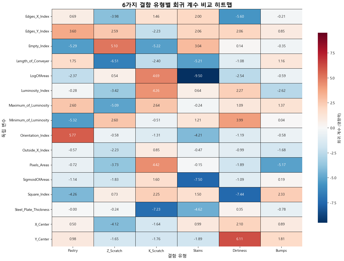
이렇게 로지스틱 모델을 만들어보고 각 요인이 모델에 미치는 영향을 시각화 까지 끝냈습니다.
느낀점.
직접 모델을 만들어보고 어떤 요인으로 결함을 검출해낼수 있는지 또는 예측할 수 있는지 확인하니 어느정도 머신러닝에 대한 이해도가 높아진것 같습니다.
그리고 머신러닝보다 중요한게 요인에 대한 검증이라고 생각합니다.
처음에 가설을 세우고 카이제곱 검정이나 t 검정으로 유의성을 확인한 것들이 실제 시각화를 통해 타당하다는 것을 보니 각 요인들에 대해 검증하고 이를 통해 모델을 구상하는 단계가 매우 중요하게 여겨졌습니다.
첫 단추가 잘못꼬이면 다시하기 마련이니 실무나 다음 프로젝트때도 제가 지금해봤었던 검정들을 그대로 쓸 수 있을것 같습니다.